Motivation to create a program
The importance of standardization of traffic signs
An important element of traffic safety is traffic signs. In the past 100 years, there has been a global standardization of the type, appearance and content of traffic signs as a reaction to the extremely increased mobility of vehicles and their planetary mass use. One of the important elements of this standardization is the choice of fonts, ie typography in a broader sense, in order to maximize the readability and comprehensibility of the textual content of the characters.
Current methodology of traffic sign construction
In the last few decades, the construction of traffic signs by design bureaus has been mostly done with AutoCAD software add-ons. There are several AutoCAD software plugins on the market that more or less accurately approximate fonts that have been defined for historical reasons by rough descriptions of Serbian Standards. The ‘roughness’ of the font description is a consequence of attempts to facilitate the preparation for making characters in traditional ways without the use of computers that were present until the mid-first decade of the 2000s.
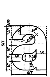
Example of character definition (SRPS U.S4.201)
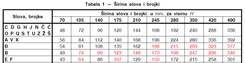
Example of character width table (SRPS U.S4.201)
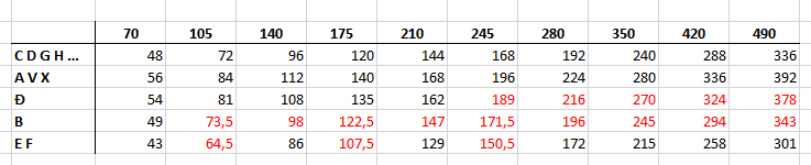
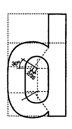
Previous values recalculated in Excel
A superficial analysis of the content of Serbian Standards shows a lack of precise definition of the details of individual characters, as well as the existence of minor or major value deviations caused by rounding or errors of another nature (marked in red). These errors are more pronounced when expressing the recalculated values \u200b\u200bof interlaced spaces, which will not be further analyzed here. In addition to these basic approximations, software solutions for AutoCAD also include additional geometric entries. Most programs approximate all possible curves that form the contours of the character with circular arcs, which is not the case with the original standard. The original standard was based on the use of ellipsoidal arches which are the basis of the general typography of all existing fonts with rare exceptions. Some programs further complicate the situation by approximating all curves with short straight segments. In this way, some font characters contain hundreds of tiny straight segments. For the process of printing characters, this is not a big problem because when printing, rasterization is performed, which is not sensitive to the number of contour segments. In case of the need to cut the foil of the sign elements, this can also be a critical factor, so the preparation must be carried out manually from the beginning.
Technical problems of preparation for printing or cutting
CorelDRAW is the program most commonly used to prepare for printing and cutting foils in vector format. AutoCAD is most commonly used to design traffic signs. Despite the fact that both programs have the ability to import or export drawings, due to internal complexities and frequent dynamic improvements of internal file formats, in practice it turned out that it is impossible to directly export a drawing from AutoCAD and import it into CorelDRAW. Therefore, this part of the process of producing traffic signs is still largely manual and requires a lot of time with the possibility of entering additional errors.
Features
- The software supplement Corel SNV Text is primarily intended to facilitate and speed up the preparation for printing and cutting of foils of traffic sign elements.
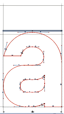
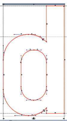
- The contours of the characters are derived by ellipsoidal arcs defined by Bezier curves according to the original SNV standard. The number of contour segments of individual characters is minimized to ensure optimal cutter trajectory.
Example of character definition in programu Corel SNV Text
- Intermediate spacing is exact to two decimal places, which minimizes the effect of horizontal expansion / contraction of the same texts depending on the height of the text and completely avoids the possibility of errors of other kinds. Extended word spacing on highways (40% increase) is supported.
- Standard dynamic line spacing depending on texts is supported. In the case of multi-line texts, the line spacing is recalculated depending on whether the individual lines have 'legs' or capital letters with 'hooks' (accents).
- The possibility of printing texts in Serbian in Cyrillic and Latin, English and all languages and scripts of nationality in use in the territory of the Republic of Serbia - Hungarian, Slovak, Ruthenian, Romanian, Bulgarian, Macedonian and Albanian was supported.
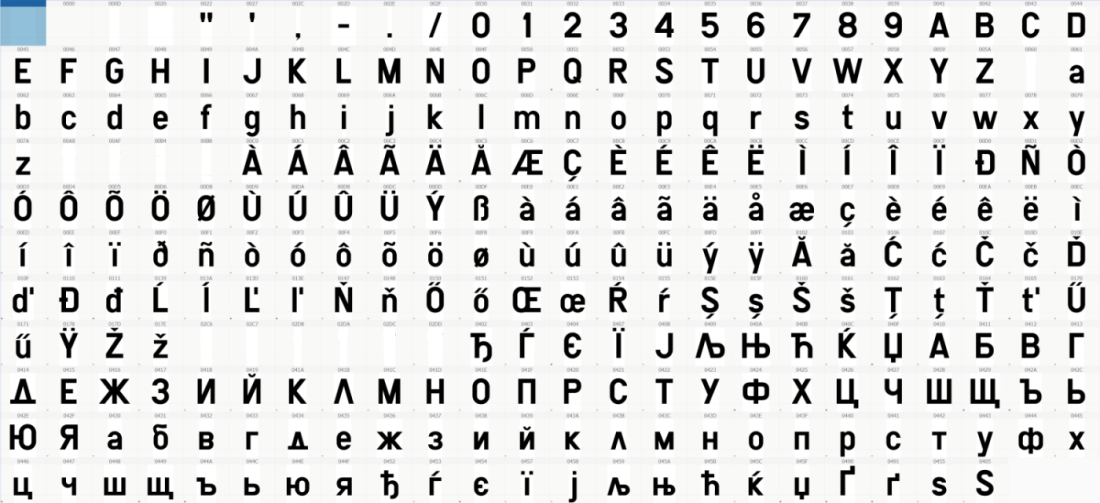
Punctuation, numbers, Latin and Cyrillic characters defined in the program Corel SNV Text
- Texts can be entered via a physical keyboard (system layouts of individual languages / scripts built into the Windows operating system) or via virtual keyboards. This makes it easier to enter texts by users who are not familiar with certain specific physical character layouts on the keyboard, but also by users who type blindly on certain physical keyboards without the need to install any system keyboard.